Friday, April 25, 2014

Packet Ideas

Creative Presentation Folder Designs 18b  For my packet, I have decided I want to have something extra with my flyer and business card. So I researched more ideas today on other things to consider for Osaka Tourism. My company is targeting a younger traveling audience, and perhaps there is something I can use. The photos mean everything to the flyer as well as the folder.  I found this cool folder design, on interest. that really pops out. I love how neatly it folds up and opens. Its concise and clear the typography its nice on this folder.

Things to Consider

Color is everything.
The Typography has to work.
The Logo colors.

Packets


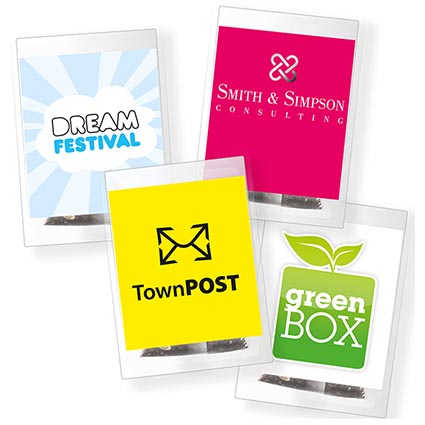
 Pyramid Pouch Tea Bags

http://www.totalmerchandise.co.uk/products/details/Pyramid-Pouch-Tea-Bags

I wanted to find another different packet to use as an example for project 4. I know that packets have many extras when companies give them out at conventions or fair. The goal of this project I feel is to grow more awareness of my company Osaka Tourism by creating a well designed packet to spark interest into my brand. I found this tea bags on a website that companies use to promote their brand. One idea I have by this is I could make something extra in my packet that would make my packet stand out. I want something interesting in my packet so that way my packet would be kept and not thrown out, I'm thinking a magnet or a special sticker would be neat to include.

Monday, April 21, 2014

Good Packets


http://www.clp.com.au/resources/Graphic%20Design%20Samples/Marketing%20&%20Promo/PopOutCubeWallet_Story.jpg

   I decided to look up good packets for more research for project 4,  when I stumbled upon a different approach to promo packets. This company online specializes in design and printing things for other companies. I found this fold cube design to be quite intriguing for any future customers, for example if I was using my own shape for the promo packets I would try this for Osaka Tourism, because I think something creative such as this could work. All the type nicely fits on the cube and is legible to read but the form keeps you reading it. The whole design is brilliant I feel for this packet because I know I wouldn't throw something like this out if it was in my mail. You want your packet to have something that will make it consumers want more from it and keep their interests at heart.

Promotional Packets

http://biddoodles.blogspot.com/2012/02/promo-packet.html


      So today we found out what project four is about and I am designing a folder with a flyer for Osaka Tourism. I figured I better look up all the information I can find on promotional packets to make my piece successful. I know we will be printing these folding from special printing and actually be making the folder by hand. I found an interesting packet online, that looks like a newspaper design with a drawstring to hold it together, I like the unique presentation this packet has. I'm impressed with the overall design of the piece because the cover has enough of curiosity to make me want to open it, I actually want to see what's inside this piece. The designer also used a fun typography that works with this piece's overall layout.

Saturday, April 12, 2014

Good Layout

     
http://coke-art.blogspot.com/2007_09_01_archive.html


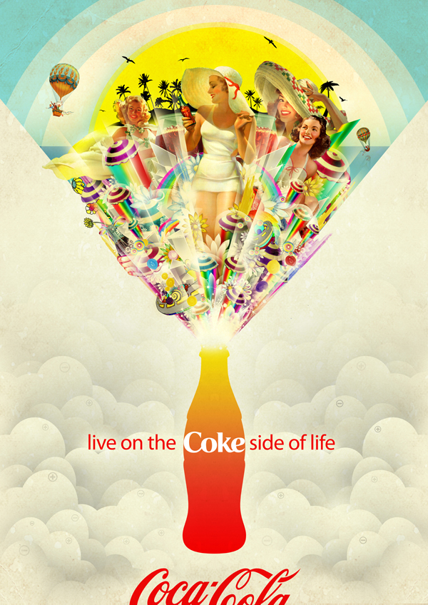
       I found a great magazine ad for coke that I found really inspirational for future reference. I found this piece from another blog by mistake and I'm glad to have this for ideas. The level of branding into this piece is impressive because it tells a story without even telling you what Coke is even about.  This woman that was created in this ad establishes a creative storytelling to the coke branding elements. The tagline on the bottom, creates a whole other version of coke with branding. Sometimes an advertisement, can really shape the company in good way because consumers can recognize right off the bat what brand it is and what they stand for.   

Graphic Design Elements

 http://www.behance.net/gallery/Graphic-Design-Branding-Game-HUD/276860


           I found a website to help me understand a page layout better. I know there are different formats you could use for many things, its just finding the right layout for your design. I know this is important when designing a webpage or logo for a company.  I found an interesting layout design for a magazine page I would use as inspiration. The fading type works well with this design, and the colors vibrate on the page in the right way. The designer uses the type to create the page.

Thursday, April 3, 2014

Magazine Ad Using The Image to Your Advantage

http://www.pinterest.com/pin/137782069821046941/


https://www.flickr.com/photos/lucianaruivo/


https://www.flickr.com/photos/lucianaruivo/8057577178/in/photostream/


36 Stunning Magazine and Publication Layouts for your Inspiration | Inspiration Hut 
I found this two page magazine spread online, that really uses the image in the spread as on good example. This image I think alone makes this spread a lot stronger because the layout is simple but effective. After finding this spread I decided to look up more about the artist because I was curious to see more work.