http://www.youthedesigner.com/2011/05/18/35-creative-presentation-folder-designs-for-identity-branding/
Sunday, May 4, 2014
Folder design
http://www.youthedesigner.com/2011/05/18/35-creative-presentation-folder-designs-for-identity-branding/
Friday, May 2, 2014
bad design
Thursday, May 1, 2014
Bad Folder Design
http://unidotstudios.ca/print_design.php
Wednesday, April 30, 2014
Folder designs
http://www.boxado.com/374_21-folder-design-ideas-to-impress-your-clients-with/

I found another website that can help me get more ideas to improve my folder design. So far I have made a lot of major changes today on the folder overall. I changed the pictures around and found a perfect image that represents Osaka the most in my company. This folder design for example has a lot of though put into the design. The designer carefully selected a color palette for the design and the red and orange make the folder look sophisticated. I love the glossy details the little pictures are on the folder and I feel the design makes the folder unique and that is something I know I want my folder to have. I want my packet to represent what exactly my company stands for, and I feel I have the right pictures this time around.
Tuesday, April 29, 2014
More Design ideas on Folders
http://www.lasvegasdesignco.com/portfolio/82-las-vegas-kit-folder-design-portfolio
I found this Las Vegas Design Company that I found interesting online when research more ideas for my packet. There a printing and design company that offers many design services to the public. This folder design is a lot more simpler and it pictures uses to create the image of the branding. Some companies use this for their branding and marketing of their brand. This folder is similar to what I am doing for my Osaka Tourism folder by using pictures to capture what Osaka Tourism is all about. I want my packet to have the right amount of branding into my folder and I have already done my flyer and business card to match the packet's theme.
http://www.lasvegasdesignco.com/portfolio/82-las-vegas-kit-folder-design-portfolio
I found this Las Vegas Design Company that I found interesting online when research more ideas for my packet. There a printing and design company that offers many design services to the public. This folder design is a lot more simpler and it pictures uses to create the image of the branding. Some companies use this for their branding and marketing of their brand. This folder is similar to what I am doing for my Osaka Tourism folder by using pictures to capture what Osaka Tourism is all about. I want my packet to have the right amount of branding into my folder and I have already done my flyer and business card to match the packet's theme.
Monday, April 28, 2014
Flyer Ideas
http://creativeincrease.deviantart.com/art/Inferno-Club-Flyer-148660715
I wanted to research more flyer ideas for Osaka Tourism. I know the image I am using is ferris wheel that I resized today to show more of Japan. I found a flyer on deviantart that I could use for reference when creating a flyer for my packet this flyer is for a music concert but I feel its a good example to use for my flyer and what to look for. The text has to flow a certain way to create that advertising and branding for that brand. There is also call to action on the page as well which I must remember to have on my flyer because its important for branding. I like how this flyer has all these images blended into one page, the Photoshop was done well into this flyer. This flyer is a good example of the right amount of branding and typography into a design.
Folder Design
http://www.youthedesigner.com/2011/08/29/54-unique-pocket-folder-and-office-stationery-designs/
So today in class my thumbnails were do and I decided on the flyer and folder I will be designing for my packet. I know that my brand colors are still the same and I want to make my folder orange. I have got bigger photos this time for my folder as well. I am going to create a flyer and folder that would properly represent Osaka Tourism. I found another website to use for inspiration for ideas to design my packet. The folder and packet for Weddings I found unique to look at. The whole design of this packet is well design overall, and I feel that this way this packet folds out definitely makes the packet more interesting because the presentation is everything in design. This folder creates a good visual of the brand and what they stand for, this is something I want to keep in mind.
Friday, April 25, 2014
Packet Ideas
For my packet, I have decided I want to have something extra with my flyer and business card. So I researched more ideas today on other things to consider for Osaka Tourism. My company is targeting a younger traveling audience, and perhaps there is something I can use. The photos mean everything to the flyer as well as the folder. I found this cool folder design, on interest. that really pops out. I love how neatly it folds up and opens. Its concise and clear the typography its nice on this folder. Things to Consider
Color is everything.
The Typography has to work.
The Logo colors.
Packets
http://www.totalmerchandise.co.uk/products/details/Pyramid-Pouch-Tea-Bags
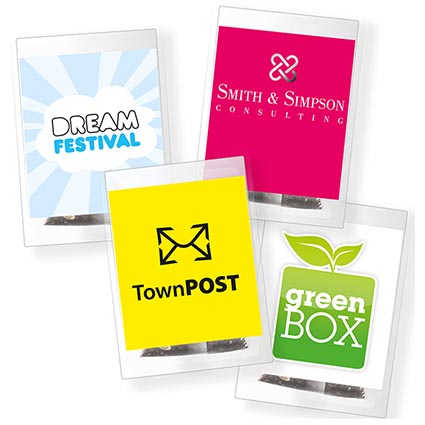
I wanted to find another different packet to use as an example for project 4. I know that packets have many extras when companies give them out at conventions or fair. The goal of this project I feel is to grow more awareness of my company Osaka Tourism by creating a well designed packet to spark interest into my brand. I found this tea bags on a website that companies use to promote their brand. One idea I have by this is I could make something extra in my packet that would make my packet stand out. I want something interesting in my packet so that way my packet would be kept and not thrown out, I'm thinking a magnet or a special sticker would be neat to include.
Monday, April 21, 2014
Good Packets
http://www.clp.com.au/resources/Graphic%20Design%20Samples/Marketing%20&%20Promo/PopOutCubeWallet_Story.jpg
I decided to look up good packets for more research for project 4, when I stumbled upon a different approach to promo packets. This company online specializes in design and printing things for other companies. I found this fold cube design to be quite intriguing for any future customers, for example if I was using my own shape for the promo packets I would try this for Osaka Tourism, because I think something creative such as this could work. All the type nicely fits on the cube and is legible to read but the form keeps you reading it. The whole design is brilliant I feel for this packet because I know I wouldn't throw something like this out if it was in my mail. You want your packet to have something that will make it consumers want more from it and keep their interests at heart.
Promotional Packets
http://biddoodles.blogspot.com/2012/02/promo-packet.html
So today we found out what project four is about and I am designing a folder with a flyer for Osaka Tourism. I figured I better look up all the information I can find on promotional packets to make my piece successful. I know we will be printing these folding from special printing and actually be making the folder by hand. I found an interesting packet online, that looks like a newspaper design with a drawstring to hold it together, I like the unique presentation this packet has. I'm impressed with the overall design of the piece because the cover has enough of curiosity to make me want to open it, I actually want to see what's inside this piece. The designer also used a fun typography that works with this piece's overall layout.
Saturday, April 12, 2014
Good Layout
http://coke-art.blogspot.com/2007_09_01_archive.html
I found a great magazine ad for coke that I found really inspirational for future reference. I found this piece from another blog by mistake and I'm glad to have this for ideas. The level of branding into this piece is impressive because it tells a story without even telling you what Coke is even about. This woman that was created in this ad establishes a creative storytelling to the coke branding elements. The tagline on the bottom, creates a whole other version of coke with branding. Sometimes an advertisement, can really shape the company in good way because consumers can recognize right off the bat what brand it is and what they stand for.
Graphic Design Elements
http://www.behance.net/gallery/Graphic-Design-Branding-Game-HUD/276860

I found a website to help me understand a page layout better. I know there are different formats you could use for many things, its just finding the right layout for your design. I know this is important when designing a webpage or logo for a company. I found an interesting layout design for a magazine page I would use as inspiration. The fading type works well with this design, and the colors vibrate on the page in the right way. The designer uses the type to create the page.
Thursday, April 3, 2014
Magazine Ad Using The Image to Your Advantage
http://www.pinterest.com/pin/137782069821046941/
https://www.flickr.com/photos/lucianaruivo/
https://www.flickr.com/photos/lucianaruivo/8057577178/in/photostream/
I found this two page magazine spread online, that really uses the image in the spread as on good example. This image I think alone makes this spread a lot stronger because the layout is simple but effective. After finding this spread I decided to look up more about the artist because I was curious to see more work.
https://www.flickr.com/photos/lucianaruivo/
https://www.flickr.com/photos/lucianaruivo/8057577178/in/photostream/
I found this two page magazine spread online, that really uses the image in the spread as on good example. This image I think alone makes this spread a lot stronger because the layout is simple but effective. After finding this spread I decided to look up more about the artist because I was curious to see more work.
Monday, March 31, 2014
A Two Page Magazine Spread
http://www.flickr.com/photos/j3concepts/4731260033/sizes/z/in/photostream/
I found another example of a an interesting of a two page magazine spread to help me with my design. This layout doesn't have a lot of color its only purple, black, and white. I like how the illustration hugs the type and blends with the page. The spread has a balance to it on both sides of the page. The article is about success in illustration and I think the spread it a perfect example of a well spread idea.
Sunday, March 30, 2014
IKEA Spread
http://www.boredpanda.com/creative-double-page-magazine-ads/?image_id=magazine-ads-ikea-sliding-doors.jpg

I found a unique two page spread from the company called IKEA and its a closet that actually opens up in the spread. The spread is has all pictures and uses the power of visuals to grab your attention. This isn't a billboard or your typical design layout. The designer not only had a good idea but I clever way to make the page in advertising functional. This Idea I like very much and I think this would be brilliant to include into my two page spread for project 3. I can have Osaka Tourism and as an interactive gateway to what Osaka Tourism has to offer, like tourist attractions and pieces of history with culture. This idea could be used for several companies out there wanting to brand their company in a special way. This is one way to do it successfully.
Saturday, March 29, 2014
Magazine Spread
http://weddingphotography.com.ph/7238/46-creative-magazine-spread-design-layout-ideas-page/
This Layout I found for a possible two page spread, possible for Osaka Tourism to be helpful. I like the story this layout tells because the designer cleverly used type to create another level of design into the two page spread. Its good to have two different elements into your design as long as they go well together, otherwise the ideas clash. The designer even incorporated the tittle's design by the illustration on the left. The pages are concise and they both have clarity to make sure the design goes well together. The designer clearly knew how they wanted to start their two page spread and finish it. A plan that is well thought out works out!
Thursday, March 27, 2014
Magazine Layout Information
http://www.smashingmagazine.com/2008/09/03/40-creative-design-layouts-getting-out-of-the-
box/
http://graphicriver.net/item/nuw-design-magazine-template/2298086?ref=Skrillex&ref=Skrillex&clickthrough_id=212159970&redirect_back=true
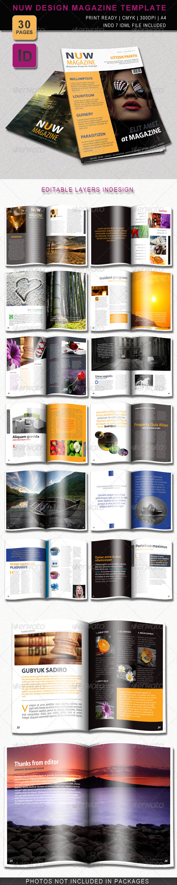
The typical size of a layout for a magazine spread is 8.5 x 11 in a standard size. I decided to research more information on magazine layout to make sure I have the right specs for this project. A magazine ad has several elements in the design we have talked about all semester. The level of hierarchy establishes the organization of the page and material that's going on the page. The importance of typography makes and breaks the piece. You don't want all the information all over the place and unorganized, because it will make the page hard to read and uneasy to follow. I found templates I could use today to help me get started for my two page design spread.
box/
http://graphicriver.net/item/nuw-design-magazine-template/2298086?ref=Skrillex&ref=Skrillex&clickthrough_id=212159970&redirect_back=true
The typical size of a layout for a magazine spread is 8.5 x 11 in a standard size. I decided to research more information on magazine layout to make sure I have the right specs for this project. A magazine ad has several elements in the design we have talked about all semester. The level of hierarchy establishes the organization of the page and material that's going on the page. The importance of typography makes and breaks the piece. You don't want all the information all over the place and unorganized, because it will make the page hard to read and uneasy to follow. I found templates I could use today to help me get started for my two page design spread.
Monday, March 24, 2014
A Closeup of A layout
I know nothing about magazine spreads so I decided to look up more information so I know my spread will be in the right format. The typography is the biggest element I need to watch out for in my design. I also wanted to know what levels of hierarchy are needed to be considered for my design when design a spread. This magazine ad for example uses a least three different fonts on the layout and has a nice photo in the first page. The picture has a great close up of the product and captures a lot of attention but doesn't take anything essential away from the page. I found this example of a two page spread to be helpful because I can clearly see the connection the two page spread needs to have in my design for Project 3. The clarity and connection is something that can't be lacking in the layout of the spread.
Sunday, March 23, 2014
Magazine Layouts: What Not to Do!
http://webdev-il.blogspot.com/2011/07/examples-of-bad-magazine-layout.html
One major thing to watch out for is too many fonts on a layout. This page isn't designed well because there are too many fonts going on in the design, you want three fonts only. Its good to have font variation but not too much that its overwhelming. This two page spread can be easily fixed by better fonts choices. You want to have a font or fonts that compliment the page and work well together. Fonts that clash create too much tension on the page.
I have found out some information on the Do's and Don'ts of Magazine layouts form a website.Things to remember when designing a magazine spread is the alignments, the colors, the images on the page, the font styles, and the edges of text. Take your spacing with type for example, the rivers of whitespace within the paragraph can cause a problem for the layout. The hyphenated and ragged edges in the paragraph can mess up the alignment of the text as well. You don't wont the type to throw off the design of the magazine spread and ruin the layout.
One major thing to watch out for is too many fonts on a layout. This page isn't designed well because there are too many fonts going on in the design, you want three fonts only. Its good to have font variation but not too much that its overwhelming. This two page spread can be easily fixed by better fonts choices. You want to have a font or fonts that compliment the page and work well together. Fonts that clash create too much tension on the page.
I have found out some information on the Do's and Don'ts of Magazine layouts form a website.Things to remember when designing a magazine spread is the alignments, the colors, the images on the page, the font styles, and the edges of text. Take your spacing with type for example, the rivers of whitespace within the paragraph can cause a problem for the layout. The hyphenated and ragged edges in the paragraph can mess up the alignment of the text as well. You don't wont the type to throw off the design of the magazine spread and ruin the layout.
Subscribe to:
Posts (Atom)