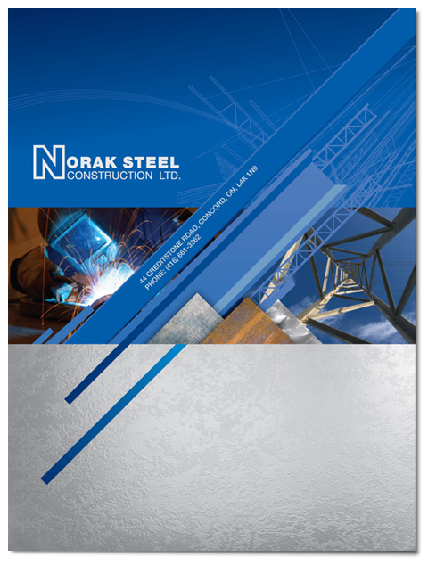
I looked up more folder design stuff to have ideas for the future so I can recall some points for a future projects. This folder design I thought design was fascinating since the tiger could be a logo for a brand and you having branding on the folder itself. I think this folder has a good source corporate identity as well within this folder. This design I feel would really help a company with getting there brand out there.
 http://www.youthedesigner.com/2011/05/18/35-creative-presentation-folder-designs-for-identity-branding/