I found another website that can help me get more ideas to improve my folder design. So far I have made a lot of major changes today on the folder overall. I changed the pictures around and found a perfect image that represents Osaka the most in my company. This folder design for example has a lot of though put into the design. The designer carefully selected a color palette for the design and the red and orange make the folder look sophisticated. I love the glossy details the little pictures are on the folder and I feel the design makes the folder unique and that is something I know I want my folder to have. I want my packet to represent what exactly my company stands for, and I feel I have the right pictures this time around.

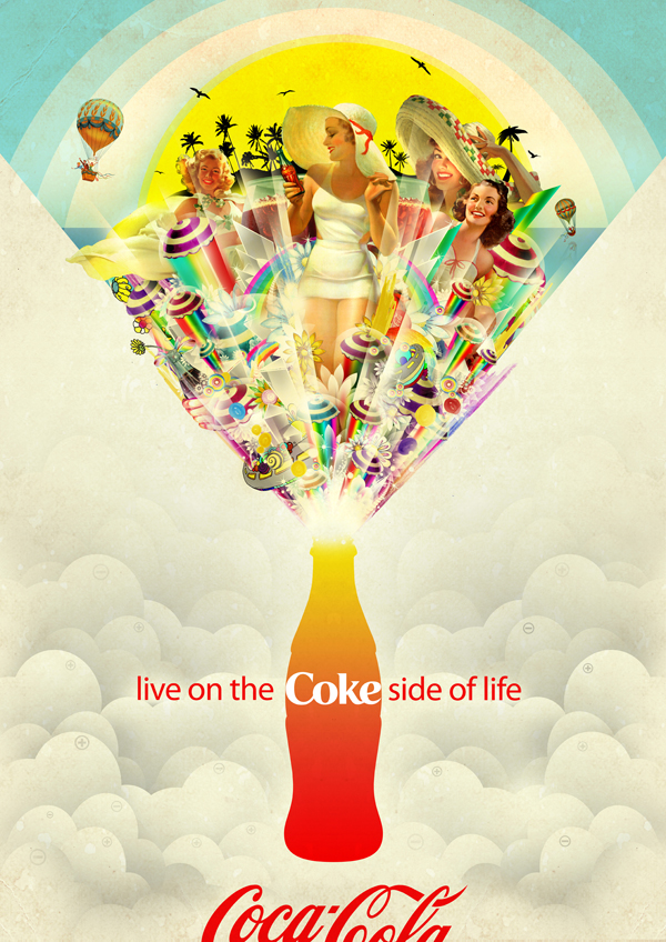
 I wanted to research more flyer ideas for Osaka Tourism. I know the image I am using is ferris wheel that I resized today to show more of Japan. I found a flyer on deviantart that I could use for reference when creating a flyer for my packet this flyer is for a music concert but I feel its a good example to use for my flyer and what to look for. The text has to flow a certain way to create that advertising and branding for that brand. There is also call to action on the page as well which I must remember to have on my flyer because its important for branding. I like how this flyer has all these images blended into one page, the Photoshop was done well into this flyer. This flyer is a good example of the right amount of branding and typography into a design.
 So today in class my thumbnails were do and I decided on the flyer and folder I will be designing for my packet. I know that my brand colors are still the same and I want to make my folder orange. I have got bigger photos this time for my folder as well. I am going to create a flyer and folder that would properly represent Osaka Tourism. I found another website to use for inspiration for ideas to design my packet. The folder and packet for Weddings I found unique to look at. The whole design of this packet is well design overall, and I feel that this way this packet folds out definitely makes the packet more interesting because the presentation is everything in design. This folder creates a good visual of the brand and what they stand for, this is something I want to keep in mind.


